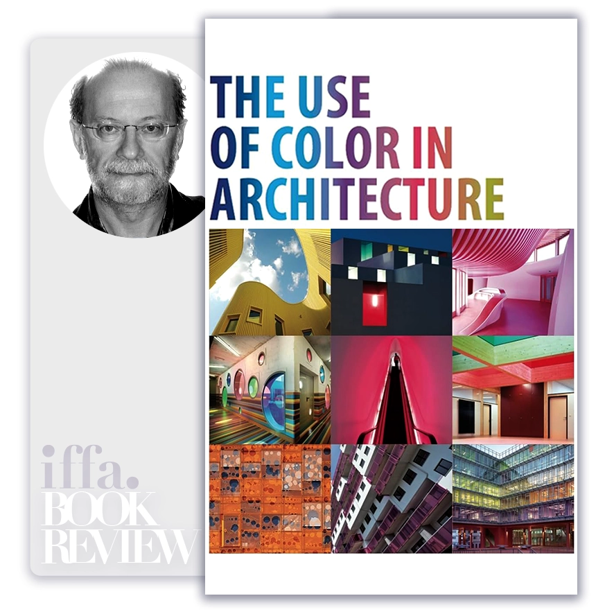
The Executive Summary of
The Use of Color in Architecture

by Carles Broto
Summary Overview:
The Use of Color in Architecture addresses an aspect of the built environment that is frequently underestimated at decision-making level: color is not decoration, but a structural force in how space is perceived, experienced, and remembered. In an era where architecture is often evaluated through metrics of efficiency, sustainability, and form, Carles Broto reasserts color as a primary architectural language—one that directly influences human behavior, well-being, and spatial clarity. The book remains relevant because many architectural failures stem not from poor form or engineering, but from misjudging how environments are emotionally and psychologically received.
For architects, developers, urban planners, and executive decision-makers overseeing large-scale projects, the book matters because color decisions carry long-term consequences. They affect orientation, identity, cultural resonance, and even how inclusive or alienating a space feels. Broto’s work reframes color as a strategic choice embedded in architectural intent, not a cosmetic afterthought. Leaders responsible for shaping cities, institutions, and living environments should care because color silently governs experience long after design narratives fade.
About The Author
Carles Broto is an architect and author whose work focuses on architectural composition, materiality, and visual language. His research and practice explore how architectural elements interact to produce coherent spatial experiences.
Broto’s perspective is distinctive because he approaches color from within architectural logic rather than external theory. He treats color as an integral design variable—on par with light, proportion, and material—grounded in built examples rather than abstract symbolism. This makes his insights particularly valuable for practitioners and decision-makers seeking applied architectural judgment rather than stylistic trends.
Core Idea:
The central thesis of The Use of Color in Architecture is that color is a formative architectural tool that structures space, influences perception, and communicates meaning. Broto argues that color operates simultaneously at physical, psychological, and cultural levels, shaping how architecture is navigated, inhabited, and interpreted.
At a deeper level, the book presents a worldview in which architecture is experienced before it is understood. Color mediates this experience by guiding attention, defining hierarchy, and establishing atmosphere. When used with intent, color reinforces architectural clarity; when misused, it introduces confusion or visual noise. The architect’s task, therefore, is not to apply color attractively, but to deploy it purposefully in service of spatial coherence.
Color does not decorate architecture; it organizes how architecture is perceived.
Key Concepts:
- Color as Spatial Organizer
Broto emphasizes that color can define boundaries, transitions, and zones within architecture.
- Color guides movement and orientation.
- Hierarchy is reinforced visually before signage is read.
- Perception Precedes Interpretation
People experience color emotionally before analyzing form or function.
- Emotional response shapes memory.
- First impressions influence long-term attachment.
- Color and Light Are Interdependent
Color cannot be separated from lighting conditions.
- Natural and artificial light alter chromatic perception.
- Poor coordination weakens architectural intent.
- Materiality Modifies Color
Surface texture and material absorb and reflect color differently.
- Color is never abstract.
- Material context determines outcome.
- Cultural Context Shapes Meaning
Colors carry cultural associations that influence interpretation.
- Universal assumptions mislead.
- Context-sensitive choices increase resonance.
- Restraint Enhances Legibility
Broto advocates disciplined palettes over excessive variation.
- Limited palettes improve coherence.
- Overuse reduces impact.
- Color Reinforces Architectural Identity
Consistent color strategies strengthen identity across projects or environments.
- Identity aids recognition and belonging.
- Inconsistency dilutes narrative.
- Contrast Creates Emphasis
Strategic contrast directs attention to significant elements.
- Contrast clarifies priority.
- Uniformity obscures hierarchy.
- Color Influences Scale and Proportion
Chromatic choices alter perceived dimensions.
- Light colors expand space.
- Dark tones compress or anchor.
- Longevity Requires Timeless Judgment
Trends fade faster than buildings.
- Timeless palettes age with dignity.
- Short-term fashion risks long-term regret.
Spatial clarity emerges when color supports form, light, and material rather than competing with them.
Executive Insights:
The Use of Color in Architecture reframes color as a governance decision within design, not an aesthetic indulgence. Leaders overseeing architectural projects often delegate color decisions late in the process, yet Broto’s work shows that color should be considered early, alongside massing and circulation.
For developers, institutions, and urban authorities, the implication is clear: color affects usability, identity, and public acceptance of architecture. Strategic color use enhances clarity, inclusivity, and longevity—while poor choices introduce friction that cannot be corrected through form alone.
- Architectural clarity improves with chromatic intent.
- User experience is shaped visually before function is understood.
- Identity and branding extend into spatial language.
- Long-term value depends on restraint and coherence.
- Design governance must include color strategy early.
Actionable Takeaways:
Architectural leadership requires chromatic discipline.
- Treat color as a core design parameter, not a finish.
- Align color decisions with light, material, and function.
- Use restraint to preserve clarity and longevity.
- Respect cultural and contextual meanings of color.
- Evaluate color choices for long-term perception, not short-term appeal.
Final Thoughts:
The Use of Color in Architecture is a reminder that architecture communicates continuously, even in silence. Color is one of its most powerful dialects—capable of calming, orienting, inspiring, or alienating occupants without a single word. Broto’s work calls for a more thoughtful, disciplined approach to this language.
For architects and decision-makers shaping environments that must endure socially, culturally, and materially, the book offers a lasting insight: when color is used with intention, architecture gains clarity, dignity, and emotional depth. When it is treated casually, even the strongest forms lose coherence.
In enduring architecture, color does not compete with form—it completes it.
The ideas in this book go beyond theory, offering practical insights that shape real careers, leadership paths, and professional decisions. At IFFA, these principles are translated into executive courses, professional certifications, and curated learning events aligned with today’s industries and tomorrow’s demands. Discover more in our Courses.

Applied Programs
- Course Code : SBM-409
- Delivery : In-class / Virtual / Workshop
- Duration : 2-4 Days
- Venue: DUBAI HUB
- Course Code : PMA-613
- Delivery : In-class / Virtual / Workshop
- Duration : 3-5 Days
- Venue: DUBAI HUB
- Course Code : CIF-505
- Delivery : In-class / Virtual / Workshop
- Duration : 3-5 Days
- Venue: DUBAI HUB
- Course Code : CIF-512
- Delivery : In-class / Virtual / Workshop
- Duration : 2-4 Days
- Venue: DUBAI HUB


