The Executive Summary of
The Complete Color Harmony (Pantone Edition)
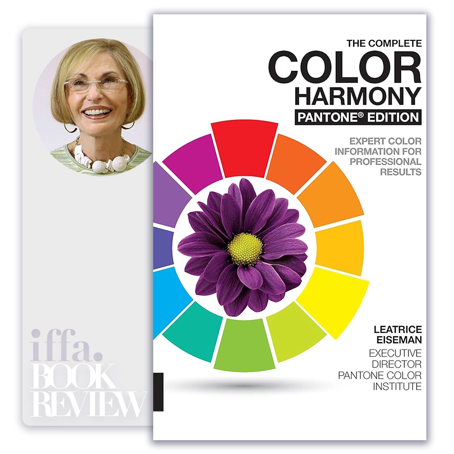
by Leatrice Eiseman
Summary Overview:
The Complete Color Harmony (Pantone Edition) remains essential because it treats color not as decoration or intuition, but as a structured language with predictable psychological and cultural effects. In leadership, branding, architecture, product design, and communication, color decisions are often made late, subjectively, or by taste alone—yet their consequences endure far longer than slogans or layouts. Eiseman’s work matters because it provides a systematic framework for making color choices that support clarity, consistency, and meaning across complex organizations and environments.
For executives, board members, and long-term brand stewards, the book addresses a deeper decision-making problem: how to translate abstract values and strategy into sensory experience. Color is one of the fastest ways people interpret intent, credibility, and quality. When misused, it creates confusion or fatigue; when used with discipline, it reinforces identity and trust. This book equips leaders to treat color as governed infrastructure, not stylistic afterthought.
About The Author
Leatrice Eiseman is a globally recognized authority on color psychology and application, best known for her leadership role at Pantone and decades of research into how color influences perception and behavior. Her work bridges design, science, and commerce.
Eiseman’s perspective is distinctive because she grounds color choice in evidence and repeatable systems rather than trend or personal preference. She connects emotional response, cultural association, and functional use, making her framework applicable across industries—from architecture and interiors to branding, fashion, and product strategy.
Core Idea:
The central thesis of The Complete Color Harmony is that effective color use depends on harmony, balance, and context—not on individual colors in isolation. Eiseman argues that color works as a system: relationships between hues, values, and intensities shape how spaces, products, and messages are perceived.
At a deeper level, the book presents a worldview in which color is a strategic communicator. It conveys mood, hierarchy, and intent before words are processed. Harmony is not aesthetic softness; it is functional coherence, enabling environments and brands to feel deliberate, intelligible, and emotionally appropriate.
Color harmony is not about preference; it is about proportion, balance, and intent.
Key Concepts:
- Harmony Is Relational, Not Absolute
Eiseman emphasizes that no color is inherently good or bad.
- Effect depends on neighboring colors.
- Relationships define perception.
- Color Communicates Emotion Instantly
Emotional response precedes cognitive interpretation.
- Mood shapes judgment.
- Color sets expectation.
- Balance Prevents Visual Fatigue
Harmony relies on proportion and contrast control.
- Overstimulation reduces clarity.
- Balance sustains engagement.
- Color Systems Create Consistency
Pantone-based frameworks enable repeatability.
- Systems prevent drift.
- Consistency builds recognition.
- Context Determines Meaning
The same color reads differently by culture, scale, and use.
- Context overrides theory.
- Application matters more than symbolism.
- Neutrals Are Structural Anchors
Neutrals organize palettes and allow accents to function.
- Neutrals create breathing room.
- Restraint increases impact.
- Contrast Establishes Hierarchy
Strategic contrast guides attention and movement.
- Hierarchy improves usability.
- Uniformity obscures intent.
- Color Influences Perceived Quality
Well-harmonized palettes signal competence and care.
- Poor harmony undermines credibility.
- Quality is felt before assessed.
- Trend Awareness Requires Discipline
Trends can be integrated without dominating identity.
- Timeless bases absorb change.
- Core palettes should outlast fashion.
- Harmony Supports Longevity
Well-balanced color systems age gracefully.
- Longevity reduces redesign cost.
- Endurance signals confidence.
When color relationships are clear, meaning arrives effortlessly.
Executive Insights:
The Complete Color Harmony reframes color as a governance decision across brand, space, and experience. Leaders often underestimate how quickly inconsistency in color erodes trust and recognition. Eiseman’s framework shows that disciplined color systems reduce cognitive friction, reinforce identity, and improve emotional alignment with stakeholders.
For boards, developers, and brand owners, the implication is clear: color strategy deserves the same rigor as visual identity, architecture, or product design. When color is governed rather than improvised, organizations gain coherence across touchpoints and time.
- Strategic clarity improves through chromatic consistency.
- Brand trust strengthens with visual discipline.
- User experience benefits from controlled contrast.
- Longevity increases with harmonious restraint.
- Color systems reduce decision noise at scale.
Actionable Takeaways:
Effective color leadership is built on structure and intent.
- Treat color as a system, not a single choice.
- Anchor palettes with disciplined neutrals.
- Use contrast to establish hierarchy and clarity.
- Respect cultural and contextual meaning.
- Design for longevity, not short-term novelty.
Final Thoughts:
The Complete Color Harmony (Pantone Edition) is ultimately a guide to making invisible decisions visible and coherent. Eiseman’s work shows that color, when used with discipline, becomes a quiet force for clarity, comfort, and credibility. When used casually, it introduces confusion that no amount of messaging can fix.
For leaders shaping brands, spaces, and experiences meant to endure, the book offers a timeless insight: harmony is not restraint for its own sake—it is the foundation of meaning and trust. Color, governed wisely, becomes a language people understand without effort.
In enduring design and leadership, harmony is not decoration; it is discipline made visible.
The ideas in this book go beyond theory, offering practical insights that shape real careers, leadership paths, and professional decisions. At IFFA, these principles are translated into executive courses, professional certifications, and curated learning events aligned with today’s industries and tomorrow’s demands. Discover more in our Courses.
Applied Programs

- Course Code : SBM-409
- Delivery : In-class / Virtual / Workshop
- Duration : 2-4 Days
- Venue: DUBAI HUB

- Course Code : PMA-613
- Delivery : In-class / Virtual / Workshop
- Duration : 3-5 Days
- Venue: DUBAI HUB

- Course Code : CIF-505
- Delivery : In-class / Virtual / Workshop
- Duration : 3-5 Days
- Venue: DUBAI HUB

- Course Code : CIF-512
- Delivery : In-class / Virtual / Workshop
- Duration : 2-4 Days
- Venue: DUBAI HUB
Related Books